Today’s Training: Voyant
Today’s Reflection Question: How would you feel about helping someone else learn how to use it? What do you notice is similar about Voyant and Gale Digital Scholar Lab as digital tools for textual analysis? What are the differences? Which did you prefer working with? Why?
In this training, I used the online text analyzing tool Voyant to analyze the text files from the University of Minnesota’s Tretter Transgender Oral History Project.
First, I uploaded the 55 downloaded ‘celan text files’ onto Voyant.
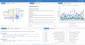
(Screenshot of my Voyant screen immediately after uploading the text file).
Looking at this output screen, the first thing that caught my eye was the word map visualization in the top left corner. It seemed to be a visualization of frequently used words across the 55 text files, where ‘think’ ‘just’ ‘people’ ‘aj’ were listed. As I hovered over each of the words, the number appeared on the pop-up screen, suggesting the total number of times each word appeared across all 55 documents that were processed. It was interesting how the word map included both quantitative and qualitative information about the frequently used words (not just the counted frequency of use, but the potential grouping of similar words), which contrasted well with the very quantitative graph shown on the right side, with the frequency of most frequently used words in each document. Everything on the screen looks clear and straightforward after the first glance, and there is not an element that is particularly confusing or hard to interpret.
After that, I followed through the rest of the tutorial to explore different tools on Voyant. is the link to the ‘Voyant view’ I created. I think it is unique that I can export the entire ‘view’ of the data analysis screen, which should be very helpful when sharing the analysis progress or results with a collaborator. 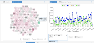
(Screenshot from my ‘Voyant view’)
The screenshot above shows two of the tools I used comparatively, TeamsBerry and Trends. I think Voyant makes it clear that the tools on different tab serves different functions and can be used depending on the user’s research needs. From this screen, I interpreted the TeamsBerry to be a visualized frequency of frequently-used words. When I clicked on a word from TeamsBerry, the graph on the right (Trends) show the trends of the use of the same words in different files. This way, TeamsBerry and Trends interact to show the bigger trend of frequently used words, as well as visualize the trend and compare the trends of multiple words.
Overall, I feel some somewhat comfortable in helping someone use Voyant. Compared to Gale Digital Scholar Lab (another online text analysis tool; proprietary), I think that the visualization is a lot simpler and the data may be easier to interpret. However, the benefits of Gale Digital Scholar Lab absent on Voyant would be advanced analysis tools such as sentiment analysis. To be more comfortable assisting others use this tool or decide between Gale Digital Scholar Lab, I will make sure to keep reviewing both of the tools and know the differences between the two, so that I can suggest the better tool for a suggested scenario.