Today’s Training: Microsoft Excel, with focus on the PivotChart tool
Today’s Reflection Question: What types of visualizations were you able to generate in Excel using PivotChart? How could those visualizations shape or impact your understanding of the data? Did you generate any visualizations that were confusing or misleading? Alternatively, did you generate any visualizations that were unexpected or illuminating?
In this training, I aimed to create 2 PivotCharts: One comparing the number of male and female voters, and another to contrast the number of newly-married couples and their real and personal estate.
This was my first time using PivotChart (I was used to manually creating charts from Insert->Bar), and I realize that it is a useful tool to easily filter and compare multiple columns in a large database.
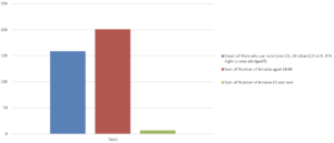
The first chart has three bars to compare the number of male eligible voters (over 18 US citizens) and counts of females aged 18 to 64, and over 65:
Although the PivotChart successfully compares the number using bars, it is hard to interpret (showing women aged over 18, but in two separate groups). The graph depends on the reader’s ability to ‘combine’ the two right bars in their mind, which is not user-friendly. A Google search tells me that I would need to manually edit the original data, as there is no functional way to display two data stacked on each other. However, combining those two female data might not achieve the desired comparison, as the number of all females in town might be different from the number of U.S. citizen females that could have had the right to vote.
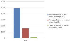
The second chart aimed to ‘connect’ the average real and personal estate, and whether people were recently married:
The PivotChart effectively shows that the average amount of real estate is over double the personal estate. However, the chart is misleading when the ‘newlywed’ data is introduced, as the data type is now the counts of newlyweds, and not the amount of money.
To summarize the training in Excel PivotChart, I discovered it was a powerful tool to quickly customize the data visualization (e.g. showing the total counts and average of data…) and comparing different types of data. While this would be a powerful tool for larger datasets, I see the need of ‘cleaning’ the data before working on data visualization and analysis to avoid misleading and confusing representations, which may occur due to different datatypes.
Sources:
“DATA VISUALIZATION WITH EXCEL” Tutorial on Vivero Peer Mentoring Website