Today’s Training: ArcGIS Online
Link to my ArcGIS map created for training: https://arcg.is/1zqSDD0
Today’s Reflection Question (response at the bottom of the page)
- How would you feel about helping someone else learn how to use ArcGIS Online? What did you find most interesting? What did you find most frustrating? What questions do you still have, and what parts of the tool do you want to explore more deeply?
In this training, I used the dataset to map the data visually using ArcGIS.
We used the 1900 Grinnell Census Data as an original dataset to use in the training.
I was impressed by how much geographical data was included in the CVS file, and could already visualize in my mind the information (such as people’s address and geographical origin) using a map.
Choosing a Basemap
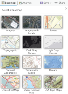 (image taken from the training site)
From my previous experience using ArcGIS, I know the customizability of the map to make it look in the way it suits the needs of the project. Different basemaps stress different details about the map. For instance, using the ‘Terrain with labels’ would emphasize the altitude, which would be suited for projects looking at the geophysical aspects of the location. On the other hand, those who are using maps to categorize geographical information might opt for the light gray canvas to color code and label the important places as needed.
- What do you notice about your visualization as you change its drawing style and customize its appearance?
- In the case of numeric data, spend some time playing around with breakpoints using the Classify Data options – try out different types of breaks, and different numbers of classes. What makes sense for the attribute you’ve chosen?
- What is gained and what is lost with different visualization options?
As I changed the datatype, ArcGIS automatically changed the list of options for how the data could be visualized. This was useful because the datatype (mainly whether it is qualitative or quantitative) was taken into account by the system, which simplified the decisions I needed to make.
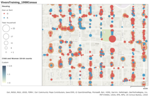
I like this layer which compares the total number of households (quantitative) and whether the house they live in is rent or owned (qualitative). The legend on the side shows that the size of the circle represents household size, while the color (red or blue) represents rent and own.
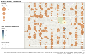
In terms of what is gained and lost in the visualization, it is harder to distinguish the two if the datatype is quantitative for both. The map below uses color to distinguish the number of male and female children under age 5 and their likely caregivers (females aged between 18 and 64). As the two circles overlap, it makes it harder to see what each point shows.
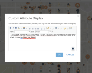
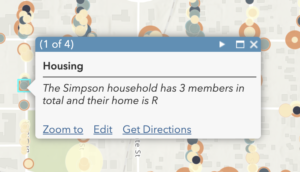
The most surprising discovery from this training was the ability to Configure Pop-Ups to modify the presentation when the user clicks on a particular data point. I was surprised by how easy this was to do, by adding text and {the actual data} (replace with the name of data). I had never been aware of the tool before, however, I believe this is a powerful tool to keep the readers aware of the data and maintain their engagement as they explore the map contents.
- How would you feel about helping someone else learn how to use ArcGIS Online? What did you find most interesting? What did you find most frustrating? What questions do you still have, and what parts of the tool do you want to explore more deeply?
I started the training being already confident with the basic operation of ArcGIS. The training made me feel reassured about my ability to execute and teach the basic operations of the tool, while there were tools I was not aware of or had not used before (namely custom data using code and custom configuration), which are likely less used by students, and therefore may be points that students want to discuss.
While I have a headstart on the basic concepts, the training was helpful in reviewing the core concepts and definition, as well as making me aware that there are always tools and ‘tricks’ that I am not aware of and can add to my toolkit, that might be helpful when discussing and using the tool with someone else.